Bixby Component Library
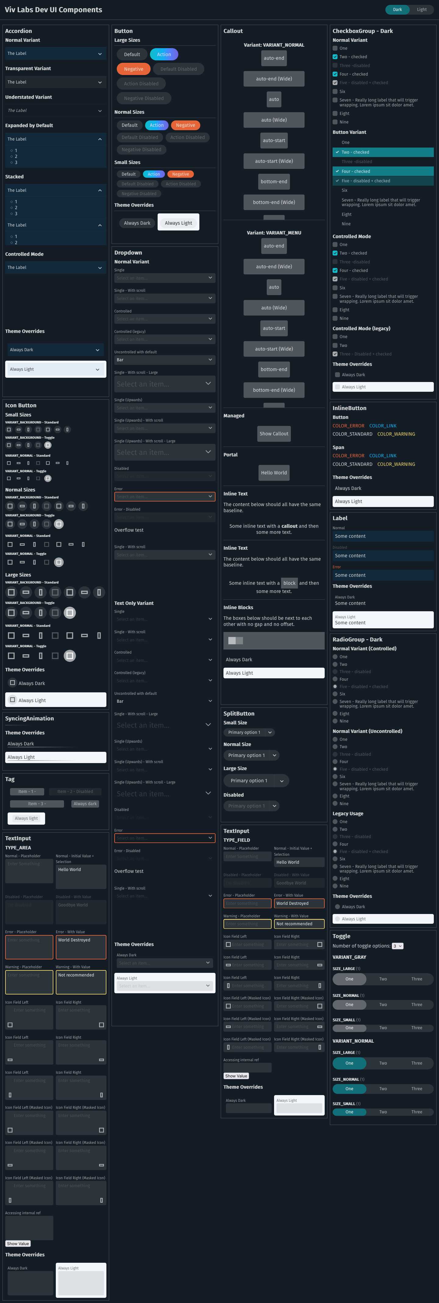
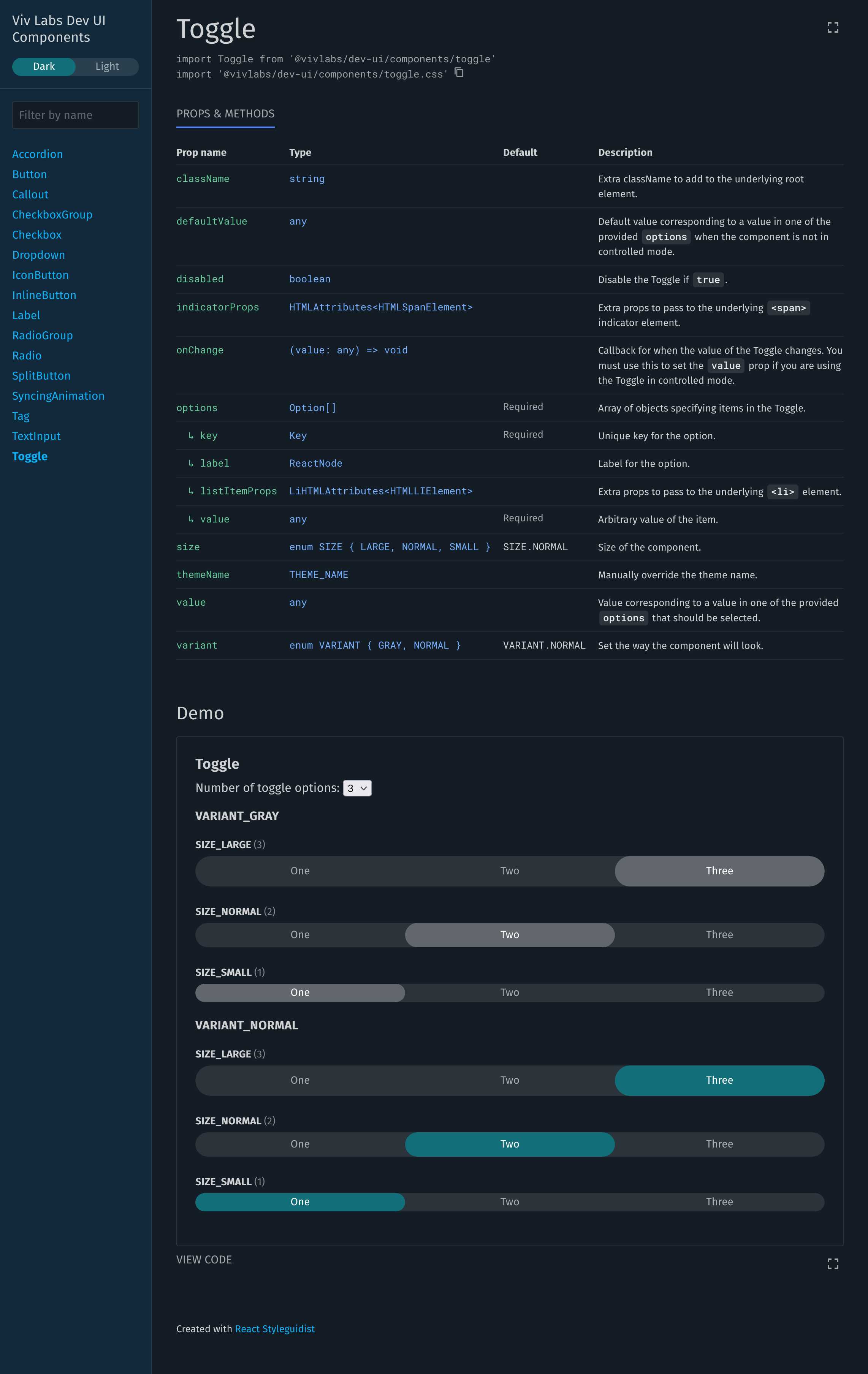
To fulfil the need of sharing visual assets between our Developer Centre Website and Bixby Studio, I created a shared component library. This was definitely a valuable learning experience for me around both UI design and API design. I found it’s often a challenge to strike a balance between API flexibility and ease-of-use. The library took full advantage of Continuous Integration (CI) where pull requests would auto-deploy both a demo and documentation webapp. Designers and other engineers could then review the proposed changes before merging. It also features 100% test coverage (except code branches) that is enforced during CI.
Technology
- TypeScript
- React
- CSS Modules
- Jest


